THE SIGNAL IN ONE SENTENCE
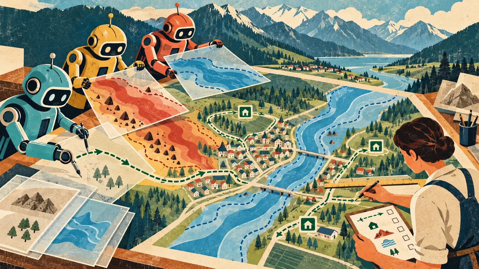
A hazard map has one job that matters more than looking official. It has to help a person make the right move before the river, fire, slope or storm removes the easy options. That makes cartography an unusually honest test for AI agents. The system can collect data, choose colors, draw boundaries and suggest evacuation routes. A polished result can still fail because the legend is confusing, the route crosses the danger zone, the shelter is inaccessible or the map quietly assumes that everyone sees, reads and moves in the same way. A new preprint called Agentic Hazard Mapper takes on that problem. It was submitted October 23 and appeared in the October 26 arXiv listing. The researchers are affiliated with ETH Zurich and the University of Tokyo. Their proposal is a multi-agent system that imitates parts of a professional cartographic workflow. Instead of asking one model to make a map in a single leap, the system divides the work into roles, lets those roles revise one another's decisions and adapts the design to the data, place and hazard. The authors first conducted a formative study with map experts. They then ran a user study and interviewed map experts and hazard practitioners. According to the paper's abstract, the generated maps improved spatial understanding and evacuation-planning performance, reduced perceived workload and completion time, and were generally preferred over the municipal maps used for comparison. That is a meaningful result. It is also the beginning of the evaluation, not the finish line. The paper does not turn an AI system into a licensed cartographer, a local emergency manager or a public authority. It demonstrates that a structured agent workflow can produce map designs people found easier to use in a study. The plain signal is simple: AI can help assemble the layers, but a named human should still own the line that tells a family where to go. Hazard maps are not neutral pictures. Every visible element is a decision. A boundary says where danger starts. A color says how severe it is. A road suggests movement. A shelter symbol implies availability. A blank area can look safe even when the dataset merely lacks coverage. The scale determines whether a resident can recognize the turn at the end of the block. The publication date determines whether the bridge shown on the page still exists. Professional cartographers manage those tradeoffs together. They reduce clutter without deleting important context. They emphasize danger without making the entire page unreadable. They fit scientific uncertainty into a visual language ordinary people can act on. That is why the multi-agent design is interesting. Hazard-map production is not one task. It is a sequence of decisions that can disagree. One role can inspect source data and coordinate systems. Another can choose the visual hierarchy. Another can check whether hazard zones, roads and shelters remain legible together. A review role can compare the draft with cartographic principles and request changes. Breaking the work apart creates something a single prompt rarely provides: reviewable intermediate choices. The map still needs a receipt. Start with provenance. Every hazard layer should identify its source, date, resolution, geographic coverage and known gaps. If flood depth came from a model, say which scenario and return period produced it. If a road network came from a public database, record when it was last checked. If a shelter list came from a local agency, confirm operating status before publication. Then record transformations. Did the system smooth a boundary, merge categories, remove small polygons, change a color ramp or move a label? Those choices may improve readability. They can also hide the street, building or pocket of risk a resident needs. Next comes route validation. A suggested evacuation route should be checked against the hazard layer, elevation, bridge status, road capacity, accessibility and the possibility that the same event closes several routes at once. The shortest line on the map is not automatically the safest path. Accessibility needs its own pass. Test color contrast and color-vision differences. Provide large-print, mobile and printable versions. Use symbols that remain distinguishable in grayscale. Write plain-language instructions. Offer the languages people in the affected area actually use. A good emergency map should survive a cheap printer, a cracked phone screen and a frightened reader. Local knowledge is not decoration either. Residents and emergency workers know that the underpass floods first, the hillside road becomes mud, the school gate is locked after dark and the official shelter is difficult to reach with a wheelchair. Those facts may not appear in a national dataset. A system trained on general cartographic rules cannot invent them safely. The production workflow should therefore include a local review round before a map becomes public. Show reviewers exactly what the agents added, removed or inferred. Let them annotate the map, reject a route and attach evidence. Preserve disagreement instead of averaging it into silence. Finally, a named official should approve the release. That is not ceremonial human-in-the-loop theater. The approver needs authority to stop publication, access to the evidence behind the map and enough time to inspect it. Their name, role, approval time and map version should travel with the public artifact. The study result also deserves careful language. The authors report better spatial understanding and evacuation-planning performance. Those are task results in a research setting. They do not prove that people will evacuate earlier, choose safer routes during smoke or darkness, or survive a real emergency at a higher rate. Preference is useful but limited too. People may prefer a cleaner map that hides uncertainty. A colorful map can feel easier while encouraging overconfidence. The best design has to balance clarity with an honest account of what the data cannot establish. The public abstract does not state participant counts, effect sizes, hazard types, jurisdictions or whether the complete system and evaluation materials are available for independent testing. Those omissions do not erase the result. They limit how far it can travel. A town should not replace its existing process because one study produced better scores. It should run a local comparison. Give residents and responders several realistic tasks. Ask them to locate their home, identify the relevant hazard zone, choose among routes, find an accessible shelter and explain what information remains uncertain. Measure accuracy, time, confidence and errors. Test the map on paper and phones. Include older adults, people with disabilities, visitors and readers who use different languages. Then test the failure cases. What happens when a layer is stale? Does the system flag the date or quietly draw the map? What happens when two data sources disagree? Does it preserve both possibilities? What happens when the requested route crosses a closed bridge? Can the agent stop instead of decorating the mistake? One useful acceptance rule is simple: no public map without a provenance panel, a local review record and a versioned approval. That rule also makes updates manageable. Emergency information changes. A shelter closes. A road reopens. A forecast shifts. The system should publish a change log that says what moved and why, then retire old versions without making the archive disappear. The practical applications extend beyond floods and landslides. Fire evacuation, tsunami planning, heat refuges, industrial exclusion zones and public-health response all depend on translating technical layers into decisions people can understand. AI agents could help small municipalities that do not have a full cartography team. They could prepare draft layouts, run consistency checks, generate accessible variants and surface missing data for a regional specialist. They could give a human expert more time for judgment instead of repetitive formatting. That is the hopeful version. The careless version is cheaper and shinier. A local office uploads incomplete data, receives a professional-looking map and publishes it because nobody can explain which agent made which decision. The first real test arrives with sirens. The difference is governance. Keep the agents inside a drafting room. Give each role a bounded job. Log every source and transformation. Invite local knowledge. Test the map with the people expected to use it. Make one human accountable for the public line. If the system saves hours while making those decisions easier to inspect, it has done useful work. If it only makes the map look finished sooner, it has accelerated the least important part.
01
WHAT ACTUALLY CHANGED
Researchers introduced a multi-agent workflow for producing hazard maps
The system was informed by a formative study with map experts
The evaluation included a user study and interviews with cartographers and hazard practitioners
The authors report better spatial understanding and evacuation-planning performance than the compared municipal maps
Participants also reported lower workload, faster task completion and a general preference for the generated maps
The paper explicitly keeps human oversight and adaptation across users and contexts in scope
02
WHY THIS MATTERS
Hazard maps influence evacuation decisions where visual ambiguity can become physical risk
Many local governments and communities lack routine access to professional cartographic expertise
A multi-agent workflow can expose intermediate design decisions for review
Study preference does not establish operational safety during a real emergency
Source provenance, local knowledge and accessibility are part of map accuracy
A named human approval gate turns review from a suggestion into responsibility
03
WHERE IT COULD HELP
- Prepare draft flood, fire, landslide, tsunami and industrial-risk maps
- Record the source, date, resolution and coverage of every map layer
- Log simplification, label movement, category merging and other transformations
- Check evacuation routes against hazards, closures, elevation and accessibility
- Generate print, mobile, grayscale and large-text variants for testing
- Run local review sessions with residents, emergency workers and accessibility experts
- Attach a named approver, version number and publication time to every release
- Publish a change log when shelters, routes, forecasts or source layers change
- Measure task accuracy and harmful errors, not visual preference alone
- Stop publication when evidence is stale, conflicting or incomplete
KEEP A HAND ON THE WHEEL
Agentic Hazard Mapper is a new author-reported preprint, not an independently replicated operational deployment. The public abstract reports improved spatial understanding, evacuation-planning performance, workload, completion time and preference, but it does not publish participant counts, effect sizes, hazard types, jurisdictions or a complete public implementation. A study task cannot reproduce panic, darkness, network failure, language barriers, mobility constraints or rapidly changing field conditions. Watch for the full evaluation protocol, public code and data, independent replication, accessibility testing, local deployments, route-safety audits, error rates, update latency and evidence that agencies can trace every public design decision to a source and accountable reviewer.
04
TERMS WORTH KEEPING
SOURCES AND VERIFICATION STATUS
This article was written from the materials below. Product claims and dates were checked against those sources on October 26, 2026.
PUBLICATION RECEIPT: The study description and reported outcomes come from the authors' preprint abstract. The provenance panel, local review, accessibility pass, route validation and named approval gate are Plain Signal analysis. No unreported participant count, effect size or real-world safety claim is inferred.
THE PUBLICATION ENGINE
WANT A SIGNAL OF YOUR OWN?
We build source-grounded publications, private briefings, and editorial systems for organizations with something useful to say.
WORK WITH US